Latin Language and Script:
Resources for the Genealogist.
The Font Problem: The Font I Wish I Had!
The 1413 Cursive font by Errance is an excellent starting point for presenting and discussing late medieval Latin and French documents. It provides a basic alphabet that is very similar to most of the "Gothic cursive" scripts that I have encountered in Swiss and French records in the 15th and 16th Centuries. It is possible to add many of the common abbreviation symbols, at least for Microsoft Word and PDF documents, by "borrowing" the abbreviation marks from other fonts, but these symbols frequently do not look well together, since they are drawn in different styles and weights and may not align correctly. It occurred to me that it would be useful for future development of fonts based on the script of this period if we had a list of the "essential" additional symbols that are required. The following list is a first attempt. Note that some symbols would not be encountered in French, in particular the signs representing common Latin word endings such as ‑rum, ‑ur, and ‑is. However, most of the other symbols do occur, at least in personal names and place names. While upper case forms of some of these symbols are occasionally seen, the use of upper case letters with abbreviation signs is so sporadic and irregular that we really do not need to include them, with the exception of the Q with the vertical stroke through the tail, representing the word Quod, commonly encountered, but easily overlooked.
The use of "combining diacritical marks" has greatly simplified the Unicode concept, but the implementation needs to take into account the proper placement over the combining character. The inclusion of some "generic" combining symbols, such as macron, breve, inverted breve, and overline, should give sufficient flexibility for representing letters and words that appear in the original script with a stroke or flourish over all or part of the word, a sort of "generalized abbreviation" sign. However, many scribes connected this stroke with the last stroke of a letter. For the purposes of representing and discussing actual texts, it does not seem necessary to provide separate characters for each of the possible ways that the "generalized abbreviation" signs are attached to the text, but it might be possible to design a combining character that would originate at the base of the preceding letter and then arch back over that letter to a point where it could connect with additional "combining overline" characters.
Not included here are ordinary letters used as superscripts, sometimes representing the last one or two letters of a word, or in a few cases representing a distinct syllable. For example, Aymoneti might be written Ayti, or trosello might be written tosello. For the latter usage, the "degree sign" (Unicode x00B0), which is perfectly round, might be preferrable, but at least in some fonts and in some browsers, a "word" containing it can break at the end of a line, even when the "word joiner" character (HMTL ⁠) is included. The "masculine ordinal" (Unicode x00BA) seems more reliable: tºsello. Superscript letters used in cursive scripts are generally only a little smaller than the lowercase letters, and they are approximately the same weight.
By far the most frequently used abbreviation sign is a stroke or flourish over a word or part of a word, indicating that one or more letters have been omitted. The stroke may cross the tops of some letters. In some fonts, the "combining overline" character works perfectly for this purpose, but in other fonts, successive overline characters do not align properly, failing to connect! The table below contains many examples of this abbreviation sign.
In the Unicode column, we include an example of the character (for combining characters, preceded by the letter o) for those characters that are included in the Junicode font.
| Unicode | Description | Samples | x0026 & — compare the 1413 Cursive font, & | ampersand symbol, more typical variant (many scribes give it a long tail) (Example: dominis priore et eius conventu, et) |  
|
|---|---|---|
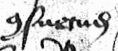
| x0256 ɖ | d with tail, abbreviation for |
|
| x0304 ō | combining macron | 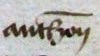 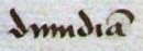  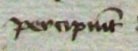   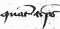    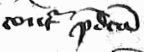 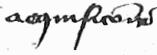
|
| x0305 o̅ | combining overline, should be placed higher than the macron, but possibly crossing through tops of letters b, d, k, l... (in other words, all the overlines must connect, even if it is necessary to cross through the tops of some letters) (Examples of combining macron and/or overline: Anthonii, dimidiam, nunc, percipiunt, nominibus, clamam, quant temps [French], non scripto, et levetur pro fratribus videlicet, freres [French], contra predictam, acquisicions [French]) | |
| x0306 ŏ | combining breve, sometimes used over the letter u to distinguish it from n, by |
|
| x030F ȍ | combining double grave accent — a similar sign, apparently not considered in the MUFI recommendations, is used to represent |
   |
| x0311 ȏ | combining inverted breve, used over p and q to represent various syllables, often exaggerated vertically (Example: Et primo; Jaqueto, showing the "inverted breve" originating from the bottom of the q, something similar is often done for the p; quibus sibi tenebatur; contra predictam; Aymoneto Quidor de Chevro pro se etc.) | 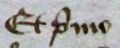 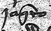   |
| x0337 o̷ | combining short "solidus", a diagonal stroke | |
| x0338 o̸ | combining long "solidus", a diagonal stroke | |
| x0361 o͡o | combining double inverted breve, over 2 letters, a more realistic way to represent a "general abbreviation" symbol than the combining overline symbol in some cases | |
| x0363 oͣ | combining a above, should be centered above another vowel, including possibly a vowel with an umlaut — with the exception of the
"combining v above", characters of this type are most often encountered in manuscripts from the |
|
| x0364 oͤ | combining e above, should be centered above another vowel, including possibly a vowel with an umlaut (Example: Schoeneveis, Foegelli, family names from the area around Fribourg) | 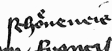 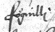 |
| x0366 oͦ | combining o above, should be centered above another vowel, including possibly a vowel with an umlaut | |
| x0367 oͧ | combining u above, should be centered above another vowel, including possibly a vowel with an umlaut | |
| x036E oͮ | combining v above (using the variant form, and usually representing a u), should be positioned above another vowel, including possibly a vowel with an umlaut — some scribes center it over the vowel, others place it to the right (Example: Daumont or d'Aumont, family name derived from the village of Aumont, Fribourg) | 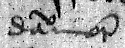
|
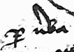
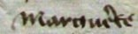
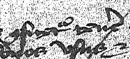
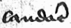
| x1DD1 o᷑ | combining |
        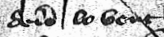  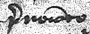
|
| x1DD3 oᷓ | combining "flattened a", but the form we see most often looks more like the outline of a violin bow, representing |
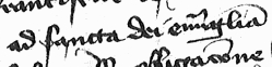   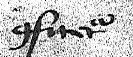 |
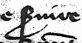
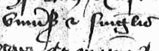
| x1E9C (the symbol shown here is a variant from the Private Use Area of Junicode) | long s with additional stroke representing |
|
| xA751 ꝑ | p with diagonal stroke through stem, representing |

|
| xA753 ꝓ | p with flourish (often counterclockwise loop through stem), representing |
  |
| xA758 Ꝙ | Q with more or less vertical stroke through an elongated horizontal tail, representing Quod (Example: Quod cum, the extra stroke is a little more elaborate than usual) | 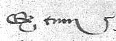 |
| xA759 ꝙ | q with diagonal stroke through the tail, usually representing quod, or other words when a "combining" symbol is added | |
| xA75B ꝛ | "rotunda" r variant: not seen very often in our sources, but we do find at least three different forms of the letter r, see below. | |
| xA75D ꝝ | 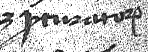 |
|
| xA75F ꝟ | v with diagonal stroke, representing |
|
| xA76B ꝫ |   |
|
| xA76D ꝭ | |
|
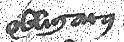
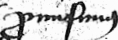
| xA76F ꝯ | symbol representing |
|
| (none) | variant of v, with long left arm (Examples: venerabili, veluti) | 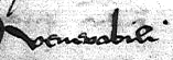  |
| (none) | variant of m, looks very similar to the letters aj (but with no dot), used frequently at the beginning of words, or as an abbreviation
for millesimo, with or without a combining diacritical mark (Example: Anno Domini millesimo; Roletus, Mermetus, et Perrissona fratres filii
quondam Williermi dicti Barbeir, showing variant m with |
 
|
| (none) | combining overline connected to the lower right corner of the letter over which it appears, this is the way many "general abbreviations" are formed, with the combining overline potentially extending back over the rest of the word | |
| (none) | one or more of the common variants of the letter r — this example shows three different forms! (Example: Perrissona uxor Guilliermi Vuarbaz douz Montelliez prope Muretum) |  |
| (none) | "closed" or "final" s variants, there are several common ones to choose from, generally appearing at the end of a word, or with a combining diacritical mark to represent "supra" (Example: Schoeneveis, family name from the area around Fribourg, ending with "closed" s; deis enfans, showing "final" s [French], quo supra, showing closed s with abbreviation mark above) | 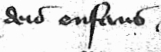 
|
| (none) | 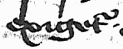 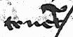  |
|
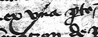
| (none) | variant of Unicode xA751, p with a clockwise loop around the stem, representing |
 |
| (none) | "etcetera" symbol, similar to the "ampersand" symbol of the period (Unicode x0026) but with a couple additional strokes |   
|
| (none) | combining |
 |
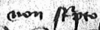
| (none) | combining symbol representing  (from the famous "ornament table" of J. S. Bach). Note that this is
not a tilde! How can we make sense of so many signs relating to "r" and "a" syllables? The set that seems to be required consists of (1) the -er hook;
(2) the true "flattened a"; (3) the tilde-like -ur sign; (4) the "wavy line"; (5) the -re sign (double grave accent); (6) the "violin bow" sign; and (7)
the "flame-like" sign. With this vocabulary of signs, I think we could represent what we see in real manuscripts reasonably well, enough to assist
students in learning how to interpret Latin abbreviations. |
|